
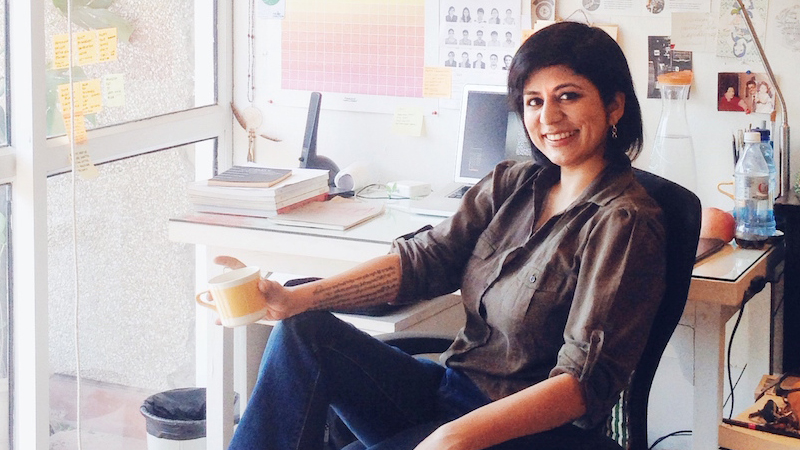
She emotes through sketches and evokes through her minutely-crafted illustrations. Meet Graphic Designer, Illustrator, Sketch Artist, Hand Letterer, spirited traveller, and lifelong learner Kriti Monga. Founder & Director at Turmeric Design, a niche collaborative design and illustration studio in New Delhi, Kriti has always displayed a creative streak. “I drew since the age of three, and I truly believe in using my hands all the time,” shares the alumnus of National Institute of Design, Ahmedabad, whose multi-disciplinary inclinations helped her acquire skills across the spectrum of design. “Working across genres is not only encouraged but expected at NID. So I learnt woodwork and developed a liking for pottery, besides learning crochet and other crafts,” says Kriti, whose design process is greatly influenced by the culture of NID.
Early Wins With RED Initiative, Pink Floyd, & SOTA Young Catalyst Award
Kriti’s designs won international acclaim in 2007, when Converse Shoes invited artists across the globe to submit shoe designs as part of Bono and Bobby Shriver’s (PRODUCT) RED initiative, a global fund to fight AIDS in Africa. Kriti’s design was selected as one of the top 100. “They sent an invite with white shoes, marker pens, and other material. We had 10 days to work on it. The only brief we got was the number 100 and idea of fighting aids. I picked 100 Indian street objects, as a metaphor for the fact that AIDS is all around us, and drew those on to the shoe. The win was hugely encouraging,” says Kriti, who then realized that her work had potential to connect with people.
In 2009, Kriti added another feather in her hat when David Gilmour, the lead guitarist, singer, and songwriter of the iconic psychedelic and progressive rock band, Pink Floyd, sought a print of her hand-lettered and illustrated poster of the lyrics of their song, Wish You Were Here, as part of his collection of memorabilia. “It was something very ordinary that I made one night and shared on Facebook the next morning. Suddenly people were responding emotionally to it and many asked for limited editions prints,” Kriti modestly recalls the work that was appreciated across borders. She went on to receive an honourable mention by SOTA (Society of Typographic Aficionados) at the Young Catalyst Awards in 2011 and received an invitation to attend that year’s TypeCon at New Orleans, USA.
How The Design Of A space – Sound, Smell, Temperature, Visuals – Can Make Or Break Your Culinary Experience
Design, for Kriti, isn’t only the facade or a superficial veneer of pretty art and expensive accessories, be it a restaurant or a store. “Design is how it speaks, how it feels on your skin, what you hear, and how you interact with it at every touchpoint,” says Kriti, who often speaks of her work in terms of its emotional appeal.
Of the design process, the former Graphic Design and Communications Head at Fab India, shares, “We see the space and converse with clients to understand what they want and where their interests lie. Any design process starts with a lot of curiosity and data-gathering. This data gets converted into a format that is compelling – a part intellectual, and part intuitive process.” Connecting the dots, her team then works to prepare the position of the brand. “Everything that we do, should, in the end, add value to the product that a person is paying for,” she says. Specifically with regard to culinary products, she shares, “A culinary experience is far more than taste alone. Food is nostalgia, our personal history, an expedition, a sense of familiarity or adventure that can be played with, a home we seek, or an intimate part of that day’s romantic or intellectual company. The design of the space – sounds, smells, temperature, visuals, textures – can make or break this experience, often entirely dictating whether the customer will come back again.”
Writings On The Wall: Smoke House Deli
Her most known work in #OurCity is etched on the walls of Smoke House Deli in the form of interactive illustrations, which resulted from Kriti’s love for the city’s history, stories of its neighbourhoods, people, and culture. “On the interactive front the detailed and layered drawings have the potential to keep the diner engaged over multiple visits. The format is fun, light, often funny, and sometimes wry. Their black and white form is simple enough to blend into the background with other interior elements if you just want an undistracted meal,” says Kriti, who spent toilsome hours (with her team) drawing them in awkwardly contorted body-positions to make these walls both functional and engaging. “These ‘living illustrations’ tell stories that live on walls and surround patrons like a wrap-around sketchbook as they dine,” she says.
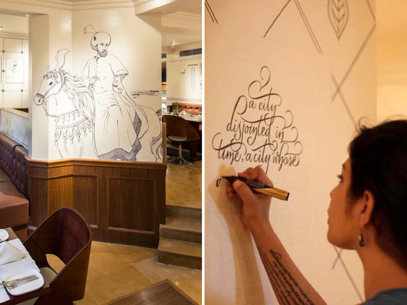
The murals on the walls of the Khan Market outlet depict humorous post-partition, Punjabi-Colonial, diplomatic, and intellectually oriented 1950s Central Delhi. While the walls of the Hauz Khas Village outlet showcase layers of history that often coexist in Delhi: from the neighbourhood’s 14th Century Khilji-Tughlaq heritage to the hipster urban village flanked by a historical lake, enveloped by lush Deer Park. “Within the overall narrative, I’ve built in ‘layers’ of information-engagement,” tells Kriti. “One of the layers is ‘hooks’ or bits of information that are easy talking points such as dates, quotes, poetry, recognisable maps or portraits. The other layer contain the nuggets of information you’ll have to Google or ask us about,” elaborates Kriti.
Looking back at the work, Kriti says, “From the quality of the drawings, to the depth of the stories, there was an unpredictable thrill to it. Instead of detailed pencil drawings, we drew with black permanent marker on walls. There was no room for mistakes. It wasn’t just a project, but an experience of a lifetime for the entire team.”
Behind The Scenes Of The Hungry Monkey: Developing A Visual Language
To give the brand a personality, Kriti thinks of it as a real person with whom the clients would engage. This is followed by adding a brand story and determining the brand positioning, with the key objective to sustain interest over a period of time. The other aspects of Graphic Design – stationery, menu, illustrations, and other experiential touches, are subsequently rendered.
Kriti lets us in about the making of The Hungry Monkey, which she calls a fun beast, “The clients came to us even before the naming stage, with only a broad idea of the cuisine and space. Over several very animated brainstorming sessions, we envisioned an experience that was stylish, with an edgy and slightly restless energy to it. We named it The Hungry Monkey, where Hungry implies curiosity and Monkey alludes to a sense of adventure. Curiosity is the beginning of adventure became our mantra for the brand and the experience.”
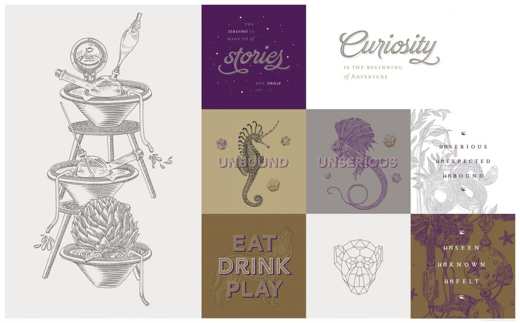
Through her interactions with the owners of The Hungry Monkey, she struck gold upon discovering a shared fascination for the sciences and imagination. She distilled these mutual fascinations into illustrations of fantastical animals and imaginary laboratory apparatus. The colour palette and typography were designed to keep customers guessing. “Alongside the graphic design and art deliverables, we created an expansive story document: chemistry in bartending, food plating ideas, uniforms (even haircuts!), music, copywriting, and of course a ton of ideation trailheads for the interiors, lighting, and accessories,” reminisces Kriti. “It was great to see the different teams take this forward within their own domains, while we kept a check to see that everything remained consistent with the overarching brand identity.”
Beyond Graphic Design: Expressions, Typography and Typerventions
By constantly reinventing her work and refreshing her thoughts, Kriti stays true to the tenets of her alma mater. It was at NID where she developed a relationship with letter forms and expressions. She is currently synchronizing her love for lettering and typefaces, and attempting to break into a new paradigm.
Kriti was one of the two primary teachers and organisers of the two-day Type Camp in India. “The way one writes or draws a word reflects an emotional connection,” she explains, “People react differently to the same word written in a Typewriter type, Grunge type, All Caps type, or a Cursive type. The perception of the word also changes with factors such as scale, colour, letter spacing, each detail contributes a distinct layer to the word.”
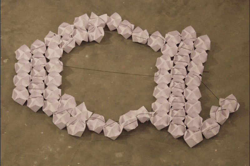
Handmade Origami fortune tellers being floated in the lake; Image: poojasaxena.wordpress.com
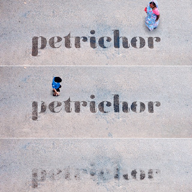
Kriti’s buoyant professional journey is often fuelled by her personal quest to find what draws people to her work. People’s emotional responses birthed Typerventions, where Kriti and her team create experimental typography installations from everyday materials to spell meaningful messages in Delhi’s public spaces. “In 2011, when HKV was starting to become a creative hub, a whole bunch of us musicians, designers, artists, etc. were forming a small community. We started making lettering installations in public spaces from inexpensive and easily available materials,” she tells. “One of these was crafted from handmade Origami fortune tellers that we stitched together and floated in the HKV lake. The words read: Hauz-E-Khas, the original name of the lake. Another time we crafted out a huge stencil from a large piece of cardboard, that read Petrichor, a word that describes the scent of rain on parched ground after a hot dry spell. As a petition to the rain-gods for respite, we carried it around different parts and streets of the city in the heat of summer and sprayed water through it. The word would gradually evaporate, leaving passers-by curious. They would then engage us by initiating a dialogue.”
Digital Detox And A Fresh Outlook
In 2016, Monga felt the need for a sabbatical to channel her inner-self and to find a fresh voice. What started as a few-months-long break intended eventually morphed into a year-long digital detox. “During this period I was invited by a dear friend, Dr. Yusuf Merchant, to an unconventional rehabilitation center, Land, that he runs in Kalyan, near Mumbai. He asked me to experience the centre and work on illustrations for the book he had written. It addressed different aspects of life and focused on particular life skills. I designed the book cover and created 15 illustrations, using different materials. It was almost like coming home to myself, a process I immensely cherished.”
Even as Kriti is making a comeback following her hiatus, she has brought home a wealth of insight that we cannot wait for her to unpack.